Plastic Attack! Post-Mortem

Winners for the Batman: Brave and the Bold game contest were announced back in August, but the individual games were released one-a-week for the 10 following weeks. My game, Plastic Attack!, launched some time in September, right as I was on my way out to the East Coast for a couple of weeks. Now that I’m back and things are somewhat starting to settle back down to normal, I thought it would be fitting to go back and take a deeper look at the game from start to finish.
The Prototype and the Pitch
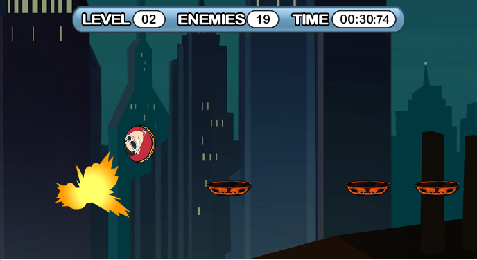
When Mochi announced a pitch contest back in March, I was already knee-deep in code for other projects. I had plenty of prototypes lying around, though, so I dusted off one I’d been meaning to expand and built a simple HTML page explaining my pitch. If you scroll down on that page, you’ll see a simple mechanics demo I built in Processing one night while I was at Georgia Tech. The idea was to do a simple platformer starring a ball with realistic squash and stretch animations. As you can tell from the demo, the ball can’t just “jump”–it first contracts down a bit and then flings itself upwards. The other balls were there simply to give the “main ball” something to bounce on, but even there you can see the core idea of “bouncing on things that are destructible.”
The thing I’m most proud of with Plastic Attack!, though, is how similar the end product is to the pitch I delivered. I knew there was a fairly quick turnaround (roughly two months from start to final submission), so I didn’t go crazy. Knowing how much I wanted to deliver was absolutely essential for such a short timeline, and it made it easy to fend off feature creep and even cut some features that would’ve taken too long to polish properly.
Production
Between the time I submitted my pitch and when the “production” phase of the contest actually started, I knew I needed to refine my workflow if I had any chance of finishing on time. Filler 2, though I like the end result, was a jumbled mess of code–after all, it was first time using “real” Flash and not just pure actionscript. To that end, I was able to squeak out Polar Games: Breakdown in April and lay down a fair bit of code that is now sort of my “stock” engine for handling things like data storage, screen management, and other useful bits. The first alpha of the game was pretty rough, though large pieces of the final game were in place: a complex keyboard input manager, a randomly generated “level” (which isn’t always “beatable” in the demo below), parallax scrolling (up & down), a 2D camera system, and a key-sequence finale. Having planned to use canned Batman animations, the only thing missing (well, the biggest thing missing) is actually the notion of squash/stretch from the original mechanics demo.
After playing the Alpha, the Warner Bros. representatives got back to me with pretty much the best idea ever: instead of trying to shove Batman animations into this game, why not use Plastic Man and stay closer to the original mechanics demo? Brilliant! There’s something to be said for working with established IP–these guys really knew their content. That one piece of advice completely turned the game around for me–not that I would’ve mailed it in with Batman animations, but using Plastic Man realigned the development to be exactly the game I wanted to make. I set out to do just that.
As soon as the alpha was a little more polished, I abandoned the notion of a random level generator entirely. The results just weren’t good enough to warrant spending more time on it, so it had to go. Though it looks like a platformer, in my head the game was supposed to play more like a racing game–where track knowledge is a key component to success or failure. The levels were constructed in such a way as to allow the player to sprint from start to finish, with occasional breaks (like the two-bounce platforms) thrown in to add difficulty. I ended up building ten levels which could be played independently (each taking ~35 to 45 seconds to complete) for medals and a “Marathon Mode” which required you to get through all ten as fast as possible (with deaths resetting you to the current level).
After doing Filler for the XBox, I was really in a “controller” frame of mind. I wrote a KeyboardManager class that basically turns it into a game controller. When you initialize it, you take any keys you like and assign actions to them. The keyboard state is polled during the game loop and builds a corresponding array of everything that happened: new keypresses, keys released, and keys still down. I liked how it worked so much that I made most of the menus respond to keyboard input on top of the usual mouse stuff for buttons. A nice side-result of this approach is that most of the platform code is fairly platform-independent. It would be fairly trivial to take my XBox controller code and plug in into the platforming code with very little effort.
What Went Wrong Throughout the production of the game, there were only really three curveballs. Soon after reviewing the Alpha, they mentioned that the resolution had to be 688×375, not the 640×480 I was building. The proper resolution was actually in the original email, so it was totally my fault. Much of the features parallax scrolling, how high you can jump, etc. had been tuned to 640×480, so that took a bit of retooling. I should have made it liquid to begin with, though, so in the end it actually improved the underlying code.
The second problem was my grandiose idea of squash and stretch. The problem with forcing the character to press down before allowing a jump is that it created roughly a 100-millisecond delay between when the spacebar was hit and when the character actually left the ground. The Warner guys didn’t like it, so they asked me to cut it. I defended my bouncing, but what I ultimately realized is that it wasn’t so much the bounce code that was the problem but the overall difficulty of the game itself (by this time several players had mentioned that they couldn’t beat the first level–more on that below). There were two options to simplify things: re-design all the levels from scratch to make them easier, or make the controls more responsive. Given the tight schedule, it was a no-brainer. The Warner guys loved it without the delay and I got to keep working on other stuff.
The final issue had to do with high scores. Towards the final Betas, I learned that the game would need to have a single “end point” with one high score. What I had was 10 levels (each with their own “low score”), and several Marathons (my original build had a straight runthrough all 10 levels, a first-5 set, a last-5 set, an odd set, and an even set). Converting the time into a point score is trivial–just take a “max” value and subtract the player’s score. Getting the game down to a single exit point, though, was slightly more worrisome. I ended up cutting all but the “full” Marathon (all ten levels in a row), which I think might’ve been a mistake (I don’t know what the right answer was, either, though). The barrier for entry on submitting a high score is just insanely high in the final build: before playing Marathon mode, you must “complete” (get at least a bronze medal) all ten levels. Though I can beat any of them in under 45 seconds, watching a few first-time players try it I’ve seen them take up to 30 minutes to beat the first level (far longer than a normal user who wasn’t playing as a favor would likely give the game). Assuming that they do finish all ten levels, they then have to finish the marathon itself–my best time is somewhere around 5 minutes, but my worst times are in the 15-20 minute range. That’s just way too long to have to play before being allowed to submit a score.
Besides the three production hiccups, I’ll also toss on a more philosophical issue summed up by a game riddle:
Q: How far can Mario jump?
A: The width of the hole in front of him.
Technically, Mario can jump further if he’s sprinting, but I think the point comes across. In most platformers (including the 2D Marios), a hole is merely one obstacle of many. Jumping is important, but it’s a binary decision. When there’s a hole, you jump over it. You don’t have to think about the hole too much–the combination of pressing the jump button and holding forward will carry you over it. The jump length in Plastic Attack! is dynamic–you move forward only as long as you hold forward down. The amount of time you stay in the air is fixed, and the default length of the jump (assuming you hold forward) is equivalent to the double-jump (it will clear two floor tiles). Whereas the “standard” platformer makes the single-jump the default action, in Plastic Attack! it’s really easy to overshoot your target (and fall to your death). Though I found it very intuitive to just ease off the forward motion when I get to where I wanted to go, it’s actually a LOT harder than I originally thought it would be.
Designing for Failure
My favorite thing about the game, though, is how hard it is. Wait, what?
I like hard games. I don’t want every game to be hard, but every now and then I thrive on a little challenge. Though I may have gone a little too far, difficulty factored into the design of the game from the very beginning. One of my absolute biggest pet peeves when it comes to games like this is what happens when you fail. Typically there will be a transition to a new screen, perhaps with some exposition or animations on how you’ll never save the universe if you keep falling to your death. At that point you’re given an option to give up or try again. In a good game, you can just press space to continue. If you really want to piss me off, you’ll require that the user click on one of the buttons to continue. I’ll put it in bold, because I think it’s that important: if your game is played with the keyboard, there’s no excuse for making your player switch to the mouse to continue playing. This is the number one reason I stop playing a keyboard-controlled Flash game, and I just don’t understand the reasoning behind it. High score submission? Fine, use the mouse. Main menus and instructions? Fine, use the mouse. Once your player commits to the gameplay part of your game, though, do them a favor and let them hang out there on the keyboard until they’re sick of playing.
More than just letting them stick to the keyboard, I wanted to design for failure. In fact, I want my players to fail. If they can play through a whole level the first time and get a medal, then I feel like I did a really crappy job designing that level. This goes back to challenge–I’ve played too many games with 50 or 100 levels that I never finish. If I don’t get a level that I fail on before I get up to level 10 or 15, I’ll stop playing a game. If there’s no difficulty, it’s just an activity–I might as well flip on the TV at that point. It’s by overcoming those failures that getting a bronze, a silver, or a gold medal actually assumes some meaning. There’s a chance that I’ll turn off a lot of players who get frustrated before getting that first medal, but my hope is that those who make it through will feel like they’ve accomplished something.
With my mini-rants out of the way, back to what happens when you die. Because dying happens so much, I felt like the process of restarting a level should be absolutely effortless. No animations that will get annoying by death #137, no waiting for recap screens to finish–I decided to just go ahead and restart the level. If the player doesn’t want to play any more, they’re most likely going to close the window anyway. If they do want to back out, they can always pause the game and exit to the main menu from there. Because the “cost” of failure is so low, I was actually pretty satisfied with the final level of difficulty.
What Didn’t Make It
There’s only one major feature that I ended up cutting: checkpoints. I didn’t want to just do checkpoints, though, I wanted to do checkpoints right. Because the game is essentially a really hard racing game, several playtesters suggested that I add checkpoints to smooth out the difficulty curve. Instead of restarting the whole race from scratch, you’d merely go back to the last checkpoint. Being a racing game, though, I would want to penalize players in some way–tacking on penalty time or just letting the clock continue to run. While this would be a blessing for beginning players just learning the levels, it completely runs afoul of my “design for failure.” Any expert player is going to reset the race as soon as they take any kind of penalty. If you’re going for a high score, there’s just no room for error. By simplifying the game for beginning players, I would’ve reintroduced the “annoying death loop” for expert players: mess up, pause, reset, start again–mess up, pause, reset, start again. In the end I just couldn’t do it.
Now that I’ve had time to think about it, my solution would be to actually commoditize checkpoints within the game world. Instead of having fixed checkpoints, they would be carried with you at all times in limited supply. For a ten-level game, you’d have 10 checkpoints to use… “ever.” If you need five checkpoints to make your way through one of the levels, those five checkpoints would be “left” in that level permanently. Should you manage to play through again and use only three checkpoints, it would free up two of them back into your pool of checkpoints. A beginning player could use as many checkpoints as necessary to beat a level and then work on refining their approach and reclaiming their “lost” checkpoints before moving onto the next level. A pro player, on the other hand, wouldn’t need to drop any checkpoints and thus could play through the entire level without needing to reset should they happen to fall. A similar mechanic was used to great success in a game called SeppuKuties a little while back.
Ultimately I didn’t have time to finish planning and balancing the feature during the hectic production schedule, so I ended up cutting it altogether.
Next Up
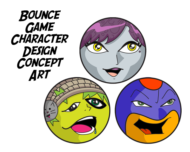
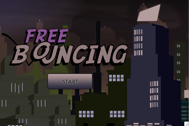
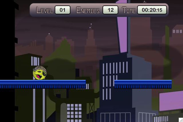
I took a break from the world of bouncing to get the XBox version of Filler out, but now I’m in full production on my own version with an artist friend. The game will be called Free Bouncing (think free running). I still have a lot of decisions to make with respect to things like microtransactions (vs just ads) and user generated content. Check out the teaser images below:


